“We have awesome Yelp reviews from your customers, yet our website is not converting. If I’m getting so much traffic from Yelp, why are we not getting calls from new clients?”
Where’s the disconnect?
We come across these situations often at Designflair, so don’t worry – we’re here to show you how you can convert your Yelp traffic into potential leads and grow your business. Great Yelp reviews are a fantastic way to bring people to your business, and that traffic often clicks through to your website. We’ll explain the process to turn that website visitor into a loyal and satisfied customer.
Visual Appeal of Your Website
When you’re thinking about Yelp reviews, your business’ website probably isn’t the first thing that comes to mind, but the two very much work together. The design, visual appeal, and functionality of your website is absolutely crucial to gaining leads for your business.
To see this connection, it helps to get in the mind of your potential clients… Say you’re online searching for a specific business and you come across one on Yelp. You click on their business and see they have good reviews, so then you click on the website to reach them. It doesn’t load right away, and you get some sort of spinning icon. You decide to stick out and wait, but when the website loads, it’s hard to read the font. The design is clunky and you have to resize the page just to find any information out about the business. How frustrating! You give up and go back to Yelp to find another site.
The above example is a site that is not mobile friendly and it’s likely you have unfortunately had these negative experiences with poor web design. This is actually a common issue with restaurant websites. I search through Yelp and find one that has 4 star reviews, yet when I go to their website I can’t find what I’m looking for. Maybe their menu isn’t available at all, or is hard to read. If I can’t find the menu, I definitely won’t show up there. Their contact information may be hard to locate or have outdated information about their business.
Web design is the bridge between your Yelp reviews and growing your business. An example of a business that makes this connection easier, is one of our clients Birk’s Restaurant in Santa Clara.
What do people want on a restaurant website?
- Look at the menu.
- Find the location.
- Reserve a table
In order to bring in business, it’s vital for people to be able to see their menu and make reservations right from their phone, tablet, or desktop. We ensured that Birk’s menus were easily viewable from any device; here’s what their menu page looks like from a mobile phone.
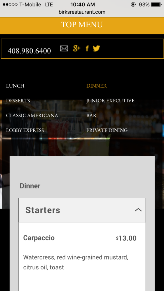
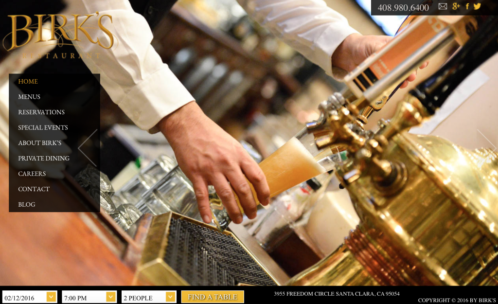
The navigation is clear and user-friendly. You can easily find their phone number and make a reservation right from these web pages, as well. You’ll see that their website is just as appealing and easy navigate from a desktop. The reservation tab is available on every page of the website.
An appealing website isn’t only important for restaurants. No matter what industry you are in, you want your business to be easily found and stand out amongst competition. We’ll share a few ways you can make this happen.
Provide Valuable Content
Once people are redirected from Yelp to your site, the information must be valuable to them and intrigue them.
One way to do this is by showing your work. Do you provide services where you can show a transformation? Including before and after photos of your work on your website is a great way to delight people who are visiting your site. Not only are good quality photos visually appealing, but they also allow people to trust your business by seeing your work.
California Dent Works relies on their website to to showcase the quality of their work and help clients understand what is truly involved with paintless dent removal. This meant that their new website design needed to focus on having an easy way to bring attention to their portfolio of before & after images.
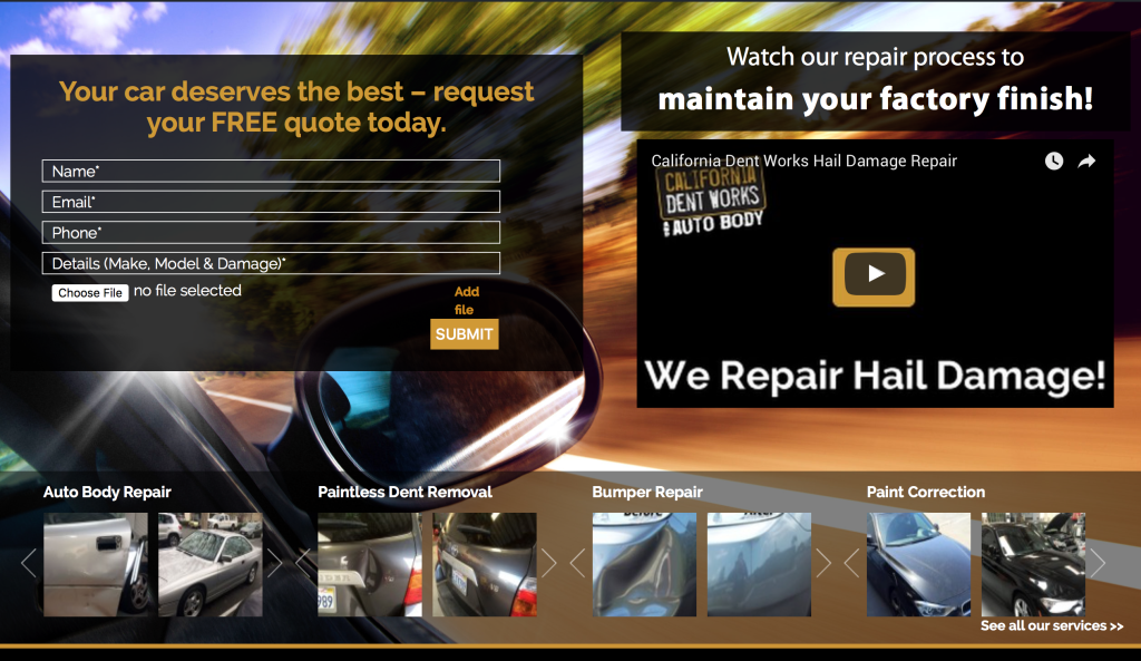
When designing their website, we made sure to place a gallery of their photos right on the home page. This adds visual intrigue, increases their credibility, and clearly displays their services. Before and after photos can be beneficial for many industries including trade businesses, beauty services, and designers. Whether you’re in the automotive industry or creative industry, including photographs of your work online will grow your business!
Another way to turn website visitors into business is by providing an easy call-to-action. In the inbound marketing methodology, this is part of the convert stage where you turn visitors into leads.
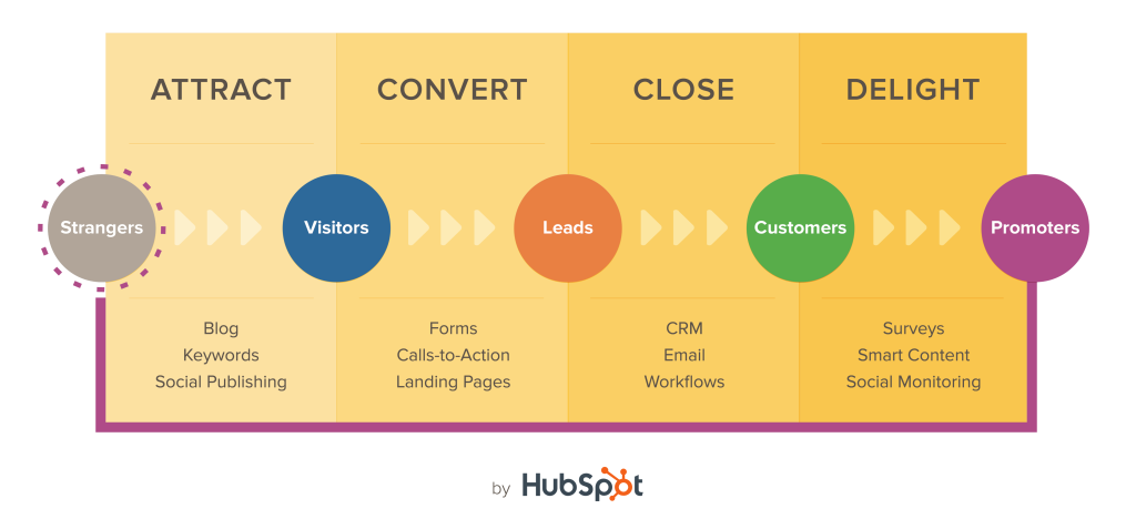
photo: Hubspot
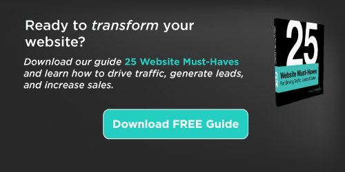
A call-to-action (CTA) can be done in many ways, but it must draw in the person visiting your site. A great way to entice a visitor is by providing an offer in your CTA, such as a white paper or a free e-book. Quicksprout’s blog is filled with great CTA’s – they are visible, concise, and valuable to the reader.
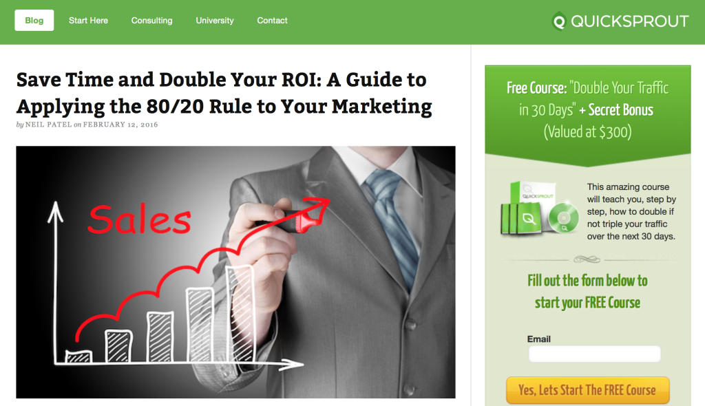
photo: Quicksprout blog
Having a call-to-action makes your website to the work of generating leads for you by getting that valuable contact information from your visitor. Ready to incorporate one into your site? We can help you decide where on your site to place a call-to-action a create an effective, appealing design.
Yelp should be utilized as a way to showcase your business and generate leads. Are you doing your part to draw in customers from the large number of people that are searching through Yelp?

