
The stats are in; smartphones have been taking the lead for internet usage, leaving the number of desktop searches behind. According to studies done last year, mobile device internet use has surpassed desktop use. If you are a business owner, your website must be mobile-friendly to ensure the success and online visibility of your website. As more and more people search the web from their phone, it’s important to develop a mobile online presence for your business.
Google recently rolled out new search engine updates, dubbed ‘MobileGeddon.’ Starting on April 21st of this year, Google began considering “mobile-friendliness as a ranking signal” for search engine results page (SERP). You can read more about Google’s MobileGeddon update here, but basically it increased the necessity for mobile websites.
Has your business been affected by MobileGeddon? Does your website look awkward from your phone or a decrease in your website’s traffic?
Many of us are aware of technological advances and that a mobile site is necessary, yet some delay investing in one. Whether you have a small, local business or are a larger retail store, a mobile website is a necessity. Investing in a mobile-friendly site is worth the time and money because it will increase traffic to your website (by being found) and improve your business’s reputation (by showing your business invests in itself as well).
What are the characteristics of mobile-friendly web design?
- Readable Text. Text on a mobile site must be comfortable for reading without zooming in or resizing the page.
- Mobile Friendly Software. Mobile sites are free from software that is not compatible with mobile devices, like Adobe Flash.
- Vertical Scroll. Scrolling horizontally is unnatural on a smartphone and Google will consider it not mobile-friendly.
How do I get a mobile-friendly website?
There are a few options for creating a compatible site for mobile devices. You can utilize a:
- Mobile Responsive Site. This means that your existing website is designed to fit mobile screens. It fits the characteristics above and resizes correctly.
- Adaptive/Dynamic Serving. Dynamic Serving is a mobile configuration that creates a different HTML depending on what device the user is viewing the site from. This is similar to having a separate mobile site, yet without a separate URL. You can check out this Google article for more information on how dynamic serving works. Or compare Responsive vs Dynamic Serving.
- Separate Mobile Site. A separate mobile site would be an entirely different domain name that people are redirected to when using a mobile phone.
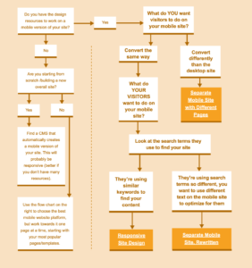
This flowchart from Distilled can help you choose which route to go.

It’s important to think about which type of site will fit your business’s needs. Need more help deciding? We can help you determine which route is best for your business, considering your existing website and your target market. We usually create mobile-responsive websites, as they are less costly than purchasing a separate domain name.
For example, Artificial Turf Express is a client we continually work with. We created a website for them that is mobile responsive, allowing their clients to view their products straight from their phone. As an ecommerce business, it is crucial for their clients to be able to view their products and business information from a mobile phone.
Consistent with the qualities of mobile-friendly sites, ATE’s website only scrolls up and down. All information is clearly displayed, from their logo to product information to the contact information.

We arranged the graphic elements of their website using a content stacking strategy, so that the site is visually appealing from a mobile phone. Taking their customers (and future customers) into consideration, we placed their phone number right at the top of the page! The navigation bar is compact, yet the pages are readable and concise. This is one example of an effective mobile-responsive site for business.
There is much that goes into designing a mobile website. We consider things such as what font to use that we be readable at a smaller size.
We can help you:
- Choose a type of mobile site for your business
- Determine content for your mobile site
- Create a web design layout that is both clear, concise and creative
- Update websites to make sure they function properly from desktops and mobile devices
Contact us today to hear more about our mobile-friendly web design services!