Branding rules everything we do! We get excited about branding because it’s very much complementary to design and marketing. Having a strong brand identity allows you to establish your business and drive your marketing strategies. Graphic design is the way you can create a cohesive brand identity and use certain marketing materials to get your business out there. So as you can see, branding, design and marketing all work together and support one another.
We keep our eyes out for companies and businesses that do branding well. We recently mentioned Red Bull’s branding and how their success is largely due to their branding efforts through their digital presence. This week we bring you another example of great branding that is pretty awe-inspiring.
Uber – the transport service that is really redefining the transportation industry, has beautiful branding that is a major part of defining their business. And when we say “beautiful” we mean beautiful.
The company actually released their branding guidelines online, allowing anyone to see their branding standards and any updates they make.
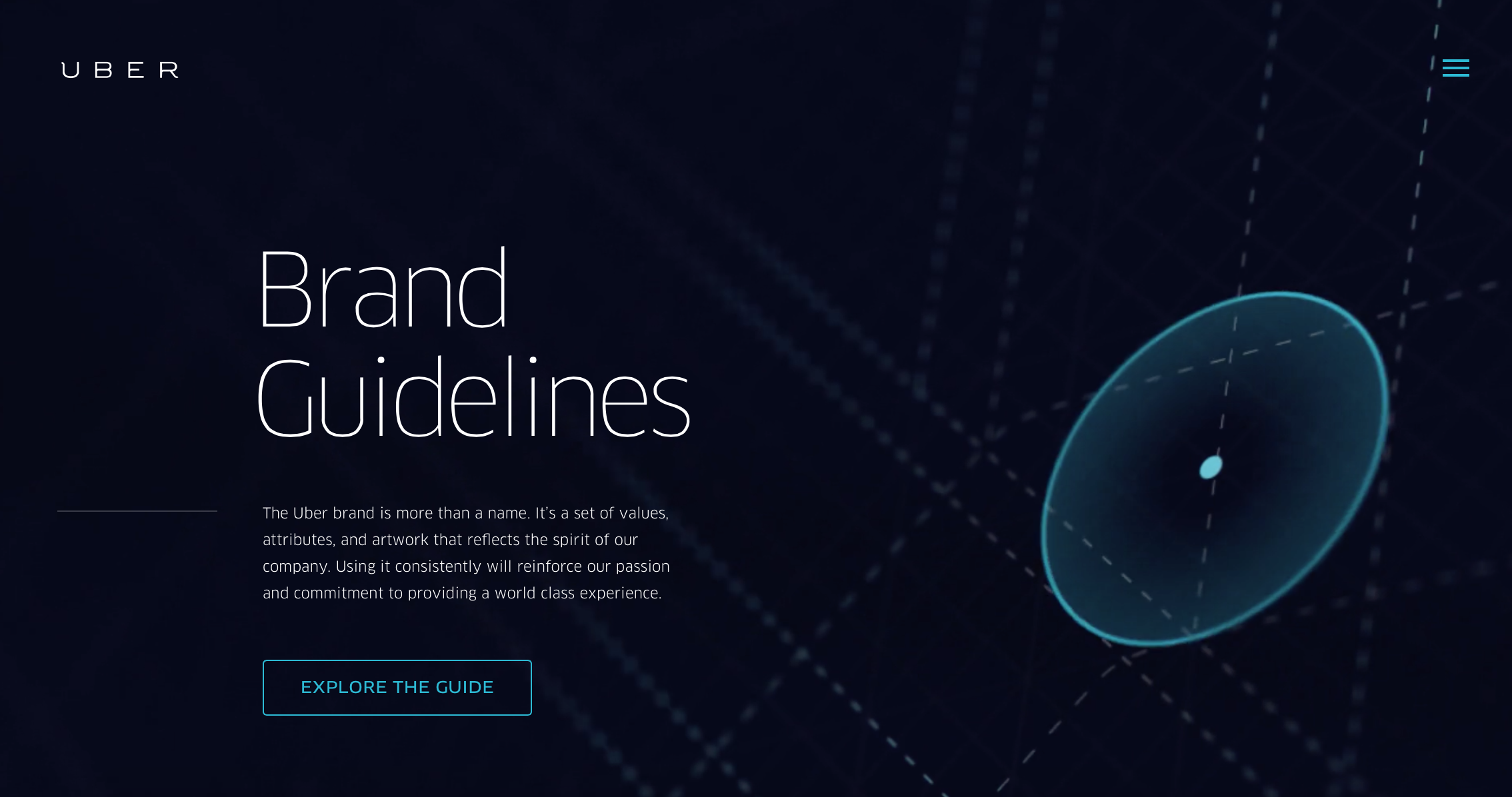
It’s an interesting move to make an online brand guide. Why would a company invest in creating a site just to show off their brand? According to the designer of the site, Brant Jow, Uber wanted to make a brand guide that is “as responsive as their product.” It’s a bold move, and a smart one because it engages their audience and shows that they are a transparent business. Branding is an opportunity to show the authenticity of your business, and Uber does that well. On the site you can find any changes or updates they make to their brand.
Their branding is not only authentic, but also intentional (as all great branding should be). On their online brand guide, you’ll find a list of their partnerships and how the logotypes (or logos) are designed to specifically suit Uber’s relationship with that partner.
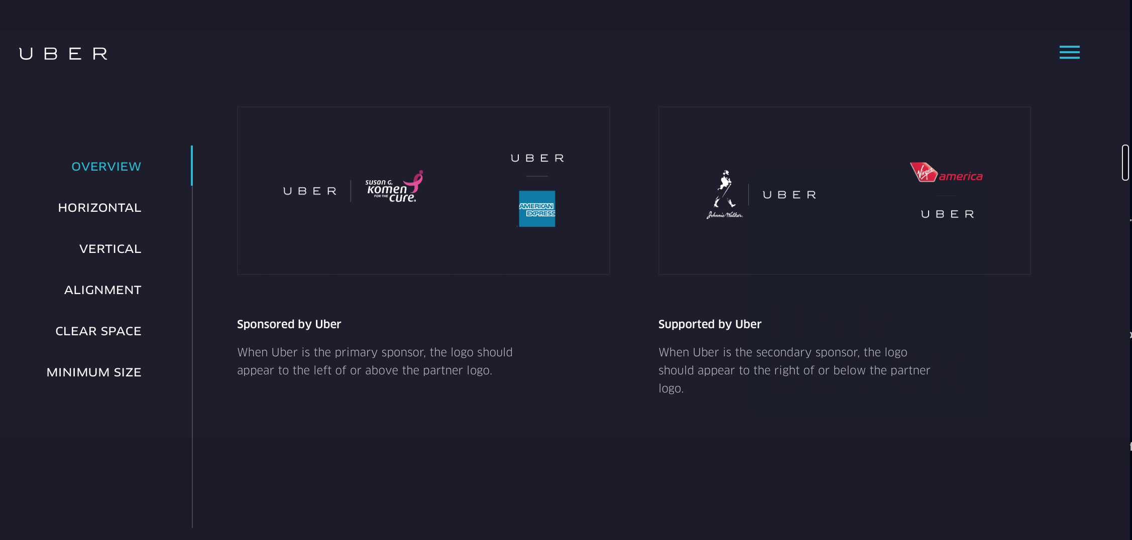
For example, Uber is a primary sponsor of American Express and therefore their logo is placed above American Express’s logo when combined for events. This is a visual way of expressing their partnerships.
Uber’s brand identity includes certain colors that are utilized across the board. They have three primary colors that make up their color palette and then various tints for more “complex graphics or illustrations.”
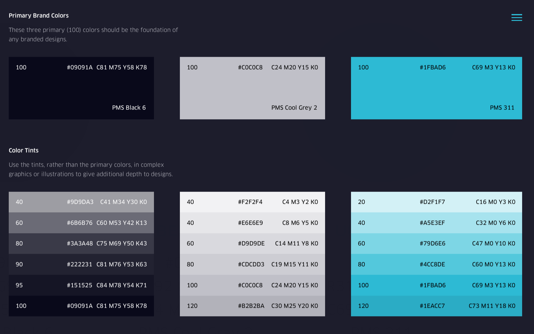
These colors are utilized on their website, social media platforms, and any of the graphics you’ll find on their website pages. Uber is not stuck to using only these colors, allowing for versatility, however the intentional use of these specific colors gives Uber a cohesive and coherent look. It’s subtle elements such as these colors that allow people to associate branding materials with whom Uber is as a business.
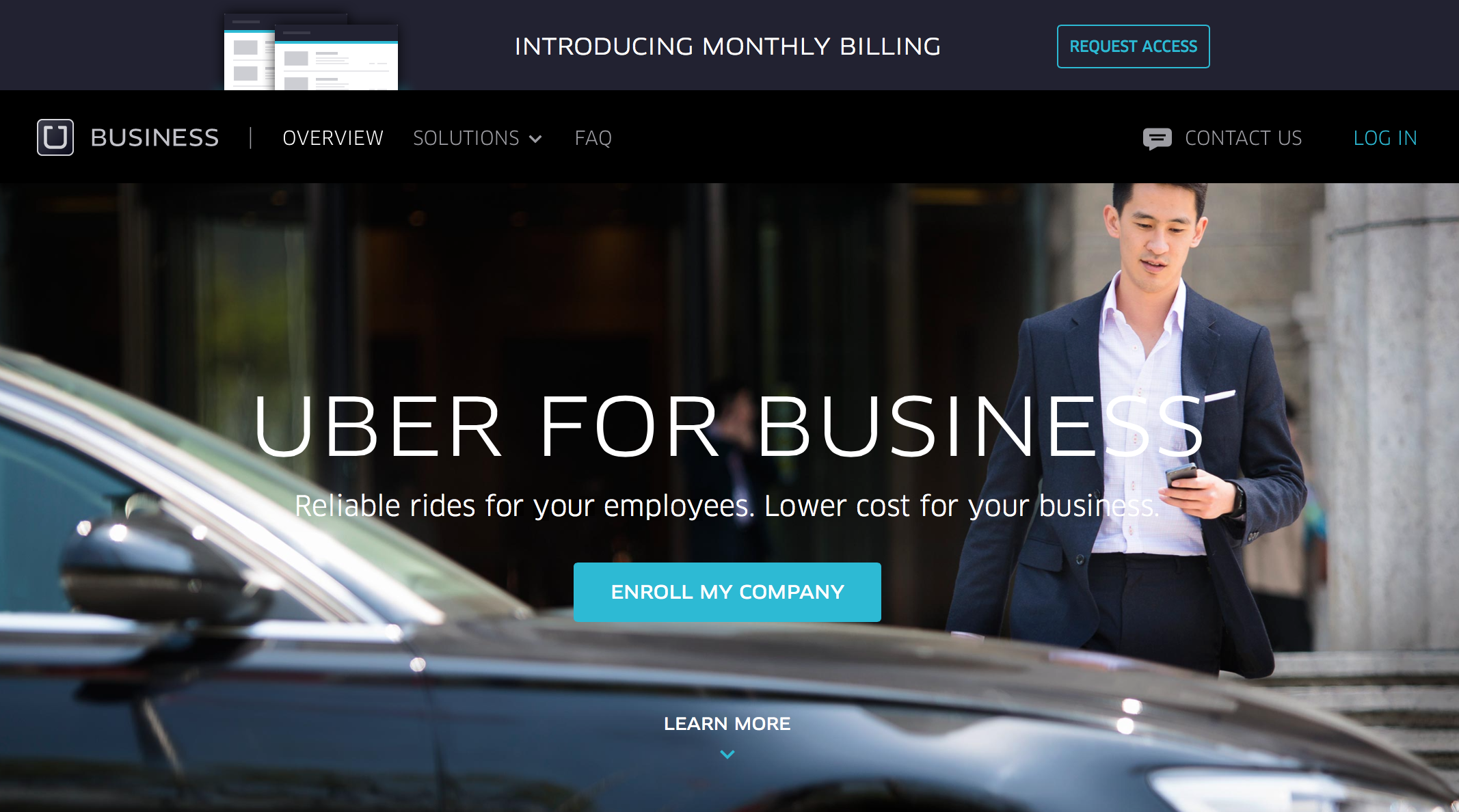 (photo from Uber business page)
Uber has grown extensively since they first began in March 2009. According to an article from earlier this month by FastCo., “In five years, Uber, which dispatches low-cost taxis and limousines operated by independent drivers, is likely the fastest-growing startup in history.” This company that began in San Francisco is now an international business! With a business that big, you need a strong brand identity. It allows them to maintain their identity no matter what city they are bringing Uber to next.
Every business, no matter how small or large, needs a great brand identity that speaks to who they are. We help our clients establish and maintain their brand identity. Get in touch with us today to discuss the branding of your business! We can help create a brand identity for you that is just as purposeful and aesthetically pleasing as Uber’s.