Helvetica… you’ve probably heard of it. Helvetica is an extremely popular and common, sans-serif typeface that arose in the late 1950’s as a move away from the ornate, and “grotesque” style of typefaces that were typically used in Germany.
Helvetica was one of the typefaces that emerged out of the International Style, which is also often called the Swiss Style. “Helvetica became a national brand, an identity for the popular ‘Swiss style’…” Smashing Magazine writes.
The International Style was a shift in graphic design, as designers felt the need to create designs that were clear and moral, with no political agenda. It was a post-war movement after the power of propaganda (and design within that) was witnessed by those in Europe during WWII. It’s known as the Swiss Style because Switzerland was an ideal for the design style to start, yet it quickly spread throughout Europe and to the United States during the 1960’s (Smashing Magazine). This part of design history is important because it impacted much of graphic design and we see influence of the International Style in design today.
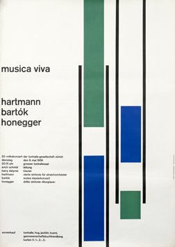
Josef Müller-Brockmann was one of the forerunners in the International Style, who wrote Neue Grafik (New Graphic Design) “which spread the principles of Swiss Design internationally (Eye Magazine).” Taking a look at his work, we gain better understanding of this style that was so impactful. The International Style has certain characteristics such as a use of negative space, blocks of texts, sans-serif fonts, and strong geometric shapes. It also commonly utilized objective photography, or clear photography that is free of distortion that is true to the item being photographed. International Style designs were marked by a sense of simplicity with the goal of effectively communicating a message through visuals.
(photo from International Poster Gallery)
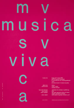
Brockmann created a series of posters for a concert in Zürich, Musica Viva (Grafik.Net). As seen in the poster above, we see the characteristics of the International Style. There is a clarity and sense of order. The use of colors is very intentional, as seen in the use of green and blue, which Brockmann was well-known for. Another characteristic of this style, seen in Brockmann’s work, is the use of sans-serif fonts and left justification of the text. These traits are consistent throughout Brockmann’s designs, from posters to building signage, and utilized by other designers of the International Style.
(photos from International Poster Gallery)
The International Style made way for coherency in graphic design, while focusing on the arrangement of content. We see a hierarchy in the arrangement of text, where the information that is more important is found in larger size font and sometimes a brighter color. There is an intentionality in the layout of content, something we see in graphic design today that we can attribute to the designers from the International Style era.
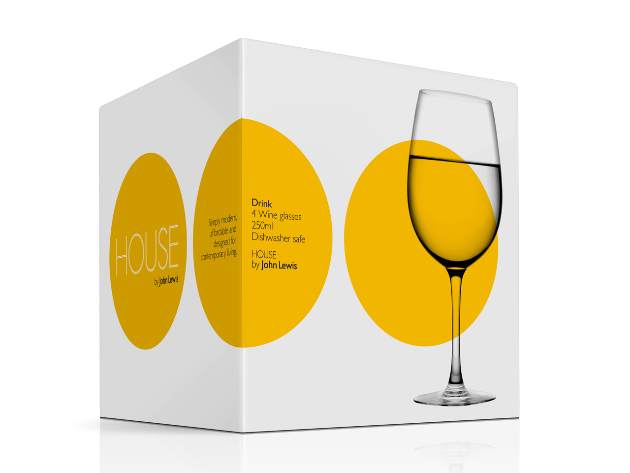
(photo from Pentagram)
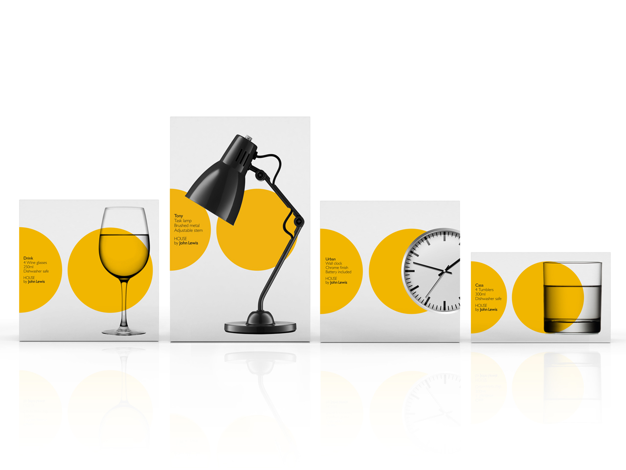
Pentagram, “the world’s largest independent design consultancy”, recently designed branding for a line of products at the John Lewis department store (London). This branding is very reminiscent of the International Style. It only uses a fresh yellow to draw attention to clear photographs of the products. Sans-serif fonts? Of course. The design style of this branding is very fitting to the product line, which is “a collection of useful and stylish products, created by [John Lewis] with modern living in mind (JohnLewis.Com).” The modernity of the product line is captured in the branding done by Pentagram.
(photo from Pentagram)
The International Style is just one of many in the past that is notable. It made the way for intentional graphic design that focuses on the layout of elements. Whether it’s text, photographs, colors or textures – each element should be placed in order to better convey a particular message. Simplicity in design, as seen in the International style, doesn’t mean that designs are simplistic, but rather effective.
Looking for some type inspiration? Take a peek at our ever-growing Pinterest board on Typography!
Follow Designflair’s board Typography | The Art of Type on Pinterest.


1 thought on “The International Style & Modern Graphic Design”
Comments are closed.