We’ve mentioned much of the importance of having a website for your business, and a well-designed site at that.
- Websites are the first place people go to find out more information about your business.
- A crucial part of your branding, a website is an ambassador for your business. It’s an opportunity to make a lasting impression on your clientele and target market.
- They are also the main way to establish online presence, also allowing you to employ marketing strategies in this highly digital age. Your digital marketing will be more effective if you have a solid website for your business to direct traffic to.
A well-designed website is going to be a major element of your brand identity (your business’s identity demonstrated through designed material). So what goes into a well-designed website? Picking the right font for a web design is fundamental, for one thing. After reading this post, we hope you’ll be as hyped about type as we are at Designflair.
Quickly, let’s clear the air about the words “font” and “type” or “typography.” Fast Co.DESIGN wrote a clever article about distinguishing fonts and typefaces. Giving us a quick definition, they summed it up; “In brief: A font is what you use, a typeface is what you see.”
So, for example, Helvetica could be called a font or a typeface. The font refers to a specific weight and size, whereas typeface refers to the design of Helvetica that is employed. Tech Terms defines typeface as “a set of characters of the same design.”
“For example, while Helvetica is a typeface, Helvetica 12 point is a font; while Caslon Openface is a typeface, Caslon Openface Bold 14 point is a font.” – Center for Book Arts
image from Center for Book Arts
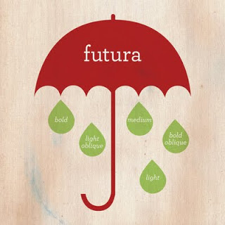
A font family is the entire collection of typefaces – each including a full set of characters. Helvetica is a font family which includes Helvetica Regular, Helvetica Light and so forth.
So you’re a typography aficionado, “type” and “font” are really used interchangeably these days. So in order prevent getting caught up in semantics, we’ll do the same.
Here are a few things to consider when determining what font to use for a web design.
Types of Fonts
Serif Font
A serif is defined as, “one of the short lines near the top and bottom of the long parts of some printed letters.” (Merriam-Webster) So a serif font is one that contains these characteristics.
When to use: Serif fonts are more ornate and tend to be used for titles and headings. Some commonly used serif fonts are Georgia, Times New Roman and Clarendon. Serif fonts are more fitting for printed work. A classic serif font Bodoni, originated in the 18th century and is well-known. It’s often associated with fashion and femininity, as it has been used for fashion labels and magazines in the past.
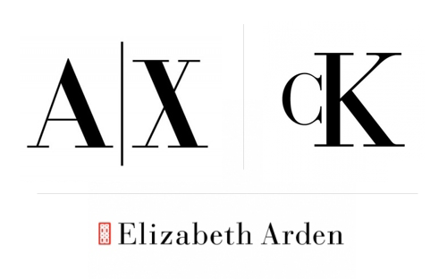 image from WordPress Blog Post on Bodoni
Sans-serif
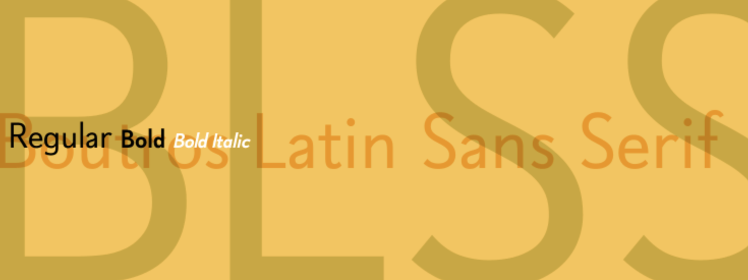
Sans-serif fonts, like Helvetica, do not contain serifs in the characters. There are no decorative embellishments at the end of the letters, numbers, or symbols. They are simple, but not simplistic.
When to use: Sans-serif fonts are used for a clean and modern look. Common sans-serif fonts are Arial, Helvetica, and Verdana. Our personal favorite sans-serif font is Helvetica Neue Light; it’s a clean and elegant font! Using a smaller font size? Go with a sans-serif, as it will be much more readable than a serif font. Sans-serif fonts are typically used for body text on website and blog designs.
Script
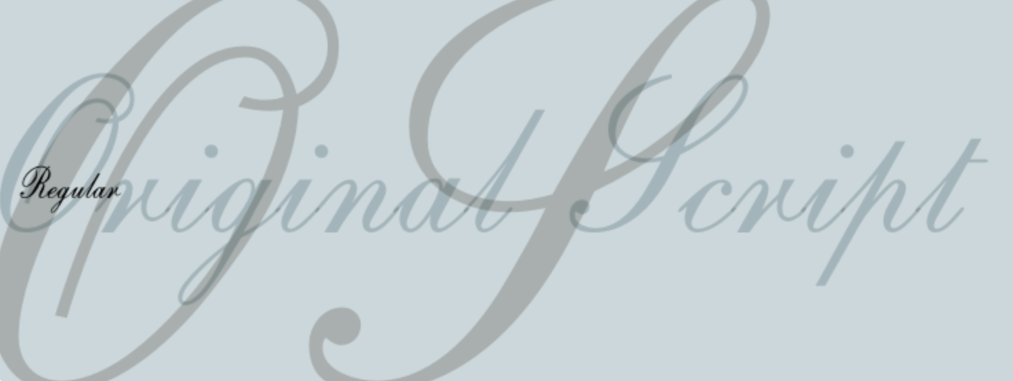
Remember the last wedding invite you received? Chances are that it was in a script font. Script fonts have become really popular in the past few years.
When to use: Script fonts scream delicacy and elegance. When creating a logo, script fonts can be fun to use. Since the characters often have long tails or flourish, there is much to work with if you are manipulating a font for a logo – resulting in a creative, fresh look. Script fonts are also great for digital signatures, as they resemble handwriting. Since script fonts are made of pretty complex characters, you don’t want to use script for large sections of text. They should be limited to headings and subheadings for web design.
Readable
It’s a no-brainer that you want people to be able to read your website content. To ensure that a font is readable, a designer must consider the type of font, the size, and the color of the text and background. Light gray on a dark gray background, for example, is very readable whereas yellow on a bright blue is not.
Consistent with your brand style
When selecting a font for web design, it should be consisting with the branding for that company or business. Is the business a photographer that focuses on family portraits? The font for the website should be warm and inviting! One way to approach picking a font can be thinking about your tagline or slogan. What is the message you are trying to convey to your audience and which font is consistent with that?
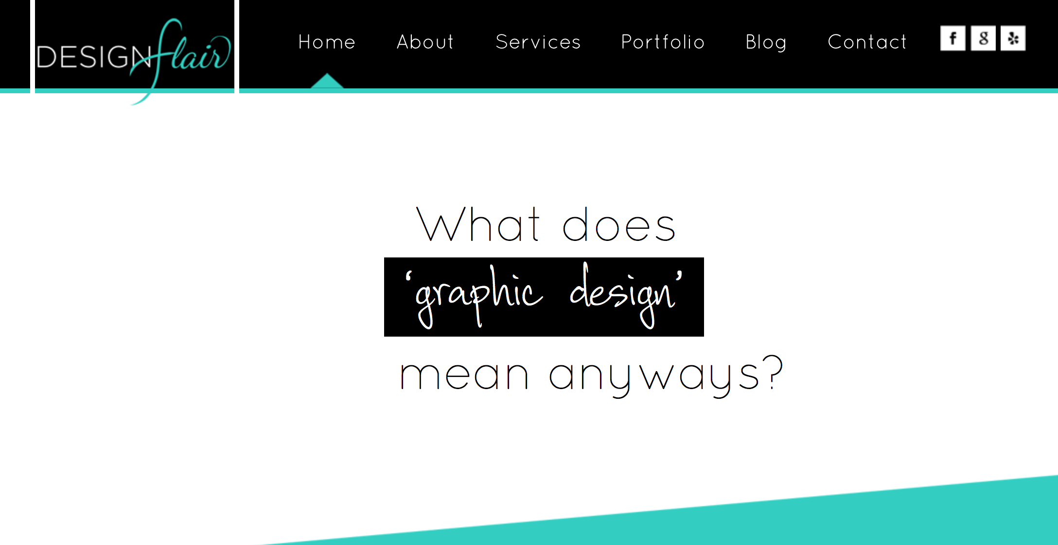
Our new Designflair website will be launching soon! Determining fonts was a crucial part of designing our new site. We chose two fonts, Quicksand and Corradine Handwriting.
Quicksand is round, with much open space in the characters. It’s a san-serif font that is great for body text! The light weight of the lines and amount of space makes it easy on the eyes. Corradine Handwriting is a nice contrast to Quicksand, resulting in a creative balance and allowing us to accent particular words or phrases.
Selecting a font is part of what we do when working with clients to create a brand identity. Every time we design a website, we also consider the font. Will it be readable? Does it match the rest of the branding for that business? We also make sure that fonts are suitable for mobile-friendly sites. Contact us today to hear more about our web design services and how we pick fonts for web design!

